Topic: Data Visualization
View as MarkdownI care deeply about clearly conveying my results and so I put extra care into making data visualizations. Here are a few articles that either focus on data visualization or display a novel result in plots:
-
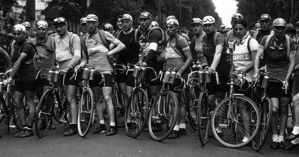
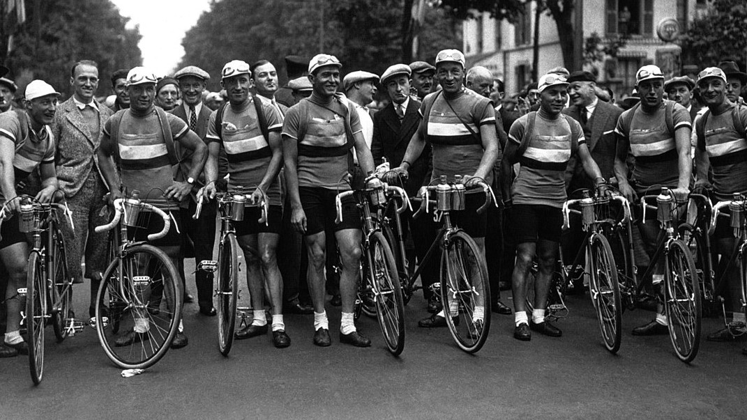
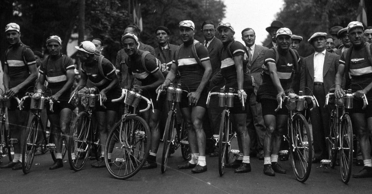 Plotting the 2022 Tour de France
The 2022 Tour de France saw a new winner, Jonas Vingegaard! See how he won in this post! -
 Comparing Zillow, Redfin, and Realtor.com Price Estimates in Time
How do various online brokers' home price estimates change in time? I use a recently sold house near my neighborhood to find out. Come check it out! -
 Comparing Zillow and Redfin Price Estimates in Time
How do Zillow and Redfin's home price estimates change in time? I use a recently sold house in my neighborhood to find out. Come check it out! -
 Comparing Pre- and Post-sale Estimates of the Price of a House
Can Zillow and Redfin predict prices accurately? I look at a house sold in my neighborhood and compare the sale price to the price predicted by Zillow and Redfin before they knew it was for sale. -
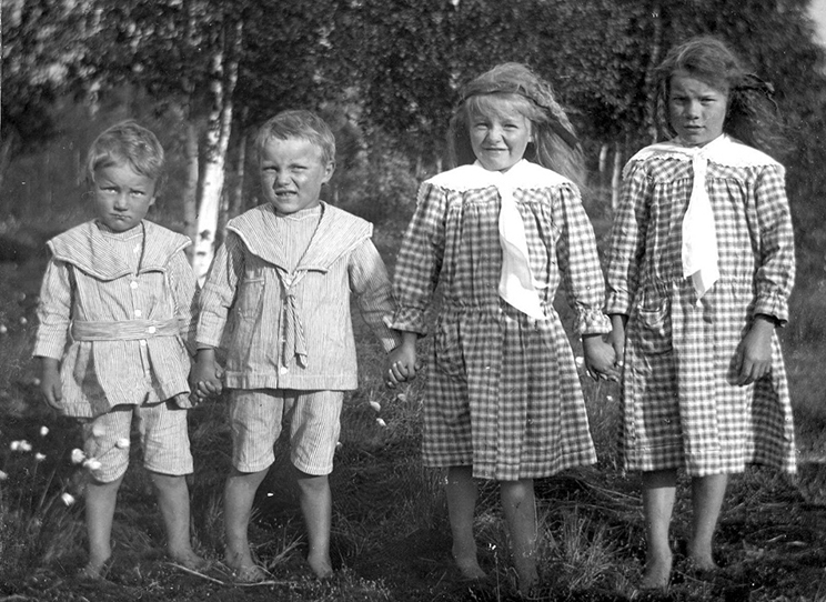
 Comparison of My Three Sons’ Language Development
I recorded the words my sons spoke as they learned our various languages and now I compare how each developed! Read on to find out how each son learned. -
 My Third Son’s Language Development
We tracked my third son's language development word by word. Here, in plots, is how he learned to speak. Take a look! -
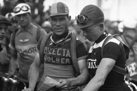
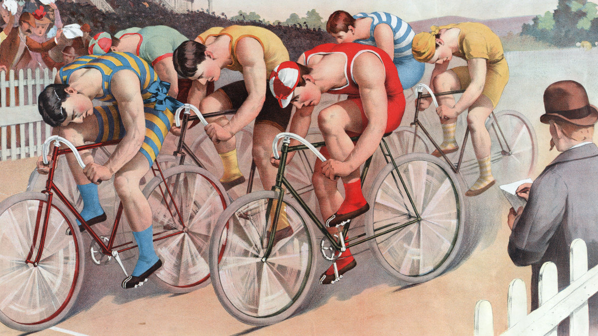
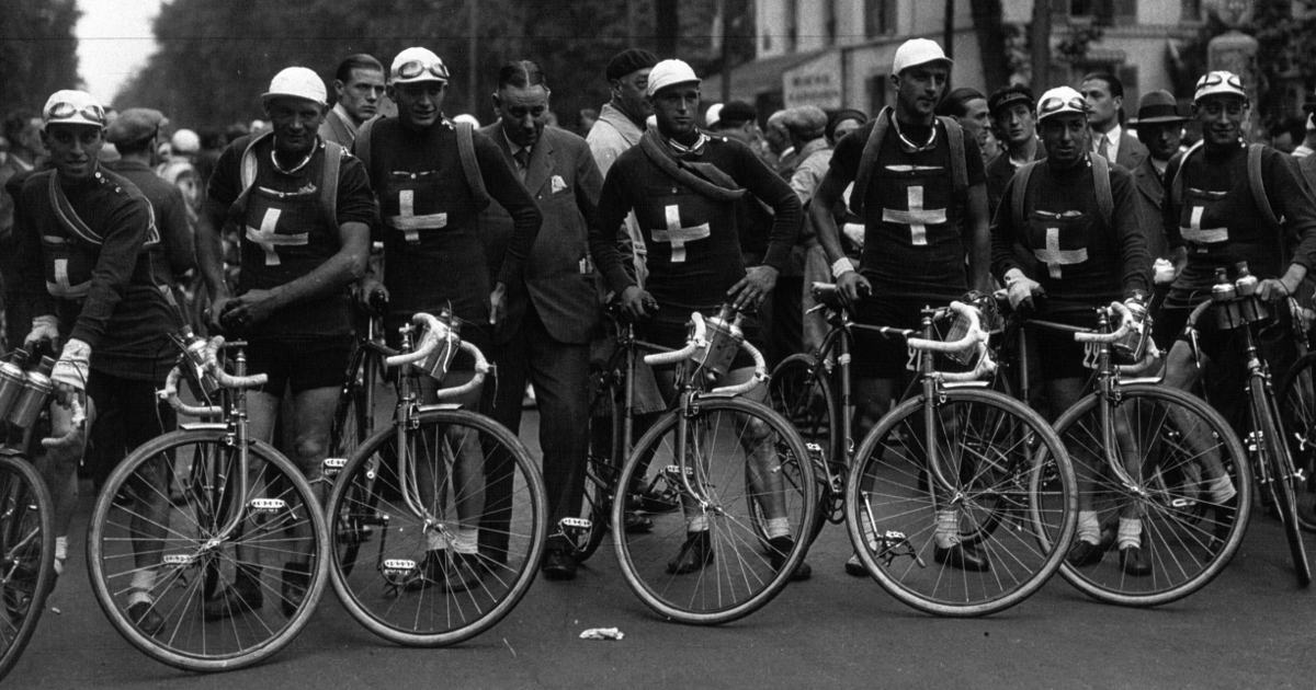 Plotting the 2021 Tour de France
The 2021 Tour de France turned out much differently from last year's edition! See exactly how it unfolded in this post. -
 Jupyter Notebook Templates for Data Science: Plotting Time Series
Jumpstart your time series visualizations with this Jupyter plotting notebook! -
 Plotting the 2020 Tour de France
The Tour de France is a race decided by mere minutes; to see exactly how those minutes were earned, read on for my plots! -
 Jupyter Notebook Templates for Data Science: Plotting
Jumpstart your visualizations with this Jupyter plotting notebook! -
 Comparison of My Two Sons’ Language Development
Being a nerd dad, I recorded all the words my first two sons spoke as they learned them. Now, I compare their language development rate! -
 My Second Son’s Language Development
My second son is a little over two years old. We tracked every word he's spoken to watch his language development, and now you can observe it too! -
 Improving Wikipedia’s Tour de France Prize Money Plot
Time to improve another plot from Wikipedia. This time I tackle one showing the prize money in the Tour de France over time! -
 Plotting the 2019 Tour de France
The Tour de France is a sporting event decided by mere minutes; to see exactly how those minutes were earned, read on for my plots! -
 Improving Wikipedia’s Hour Record Plot
I love Wikipedia, I love cycling, and I love data! So today, I improve Wikipedia's Hour Record Plot! Come take a look! -
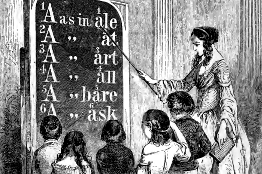 My Son’s Language Development
My son is a little over two and unfortunately he has two huge nerds for parents. We tracked every word he's spoken to watch his language development, and now you can join us! -
 Improving An Old Supernova Plot
I learned to use matplotlib more than ten years ago. Around that time, I made a plot of supernova 2002cx for Wikipedia, but it was not terribly good. So this year, I updated it! -
 Making Animations Quickly with Matplotlib Blitting
Animating plots is great way to show how some quantity changes in time, but they can be slow to generate in matplotlib! Thankfully, blitting makes animating much faster! Learn how to here! -
 Rise and Fall of Popular Names
The popularity of baby names rises and falls based on the tastes of each generation of parents. Are their preferences the same for boy's names as for girl's names? I plot the trends to find out! -
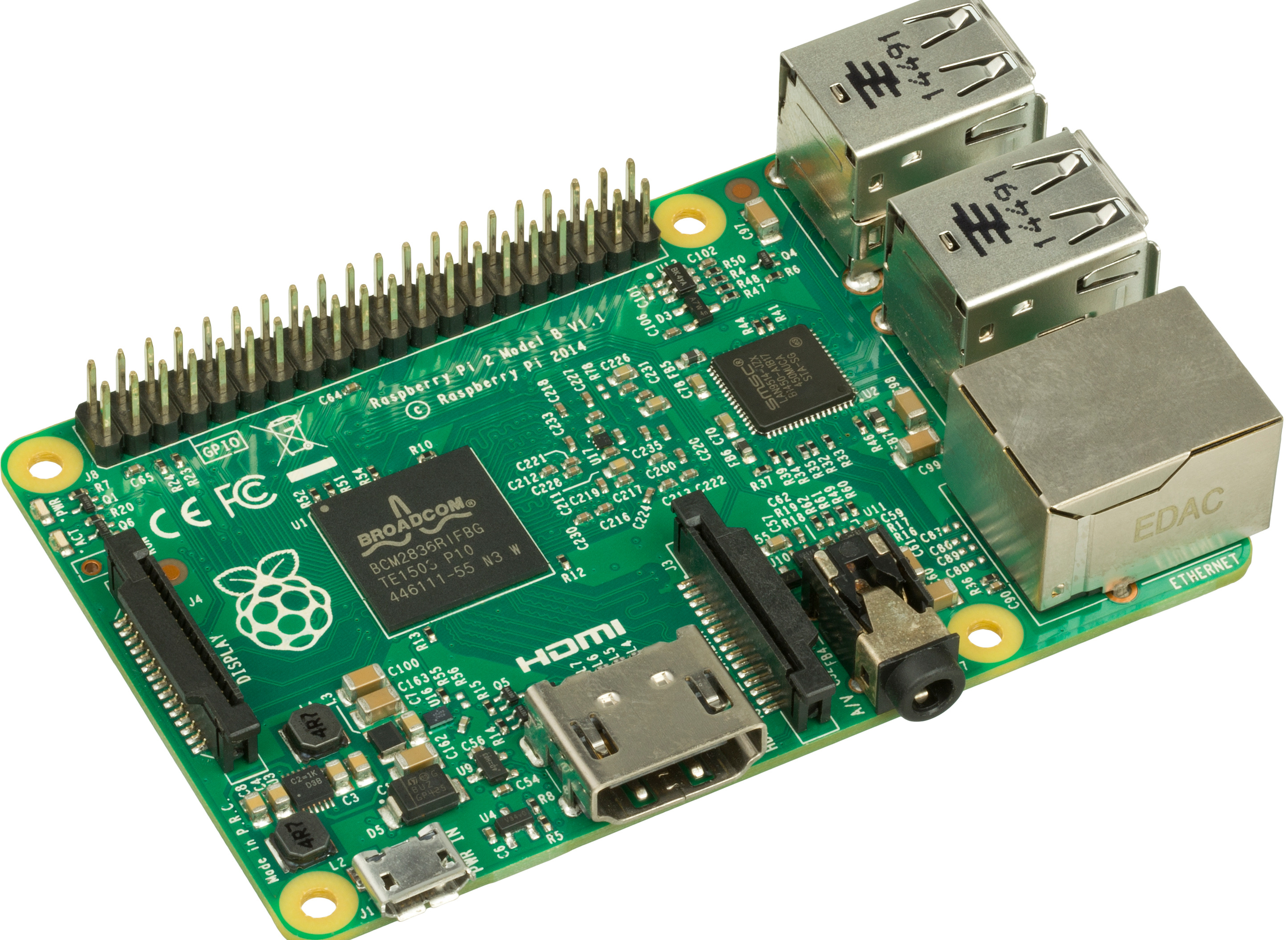 How Fast Does a Raspberry Pi Reboot?
My Raspberry Pis have to reboot every evening to avoid a memory leak. As they say, when you have a memory leak, make animated plots to see how fast they reboot! -
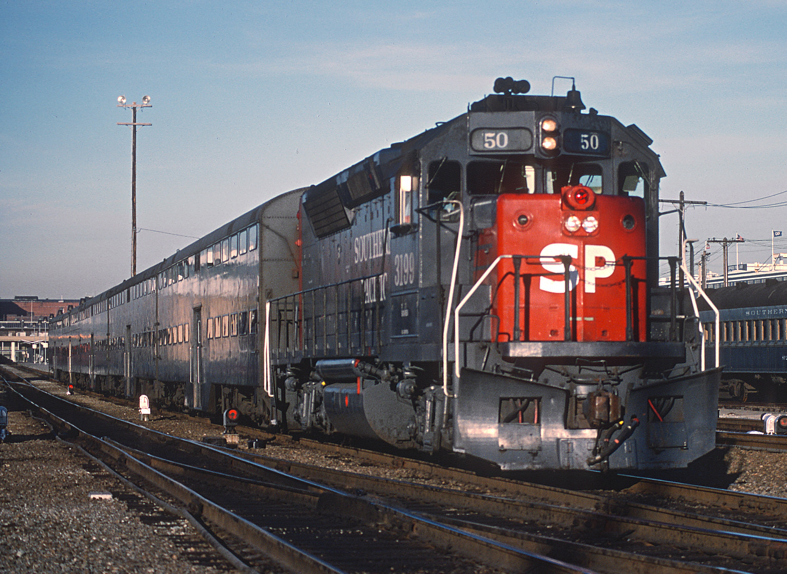 Updated Caltrain Visual Schedule
In July, Caltrain updated their weekend schedule to allow time to do track work, so I updated my Marey/Ibry/Serjev visual schedules to see how it changed! -
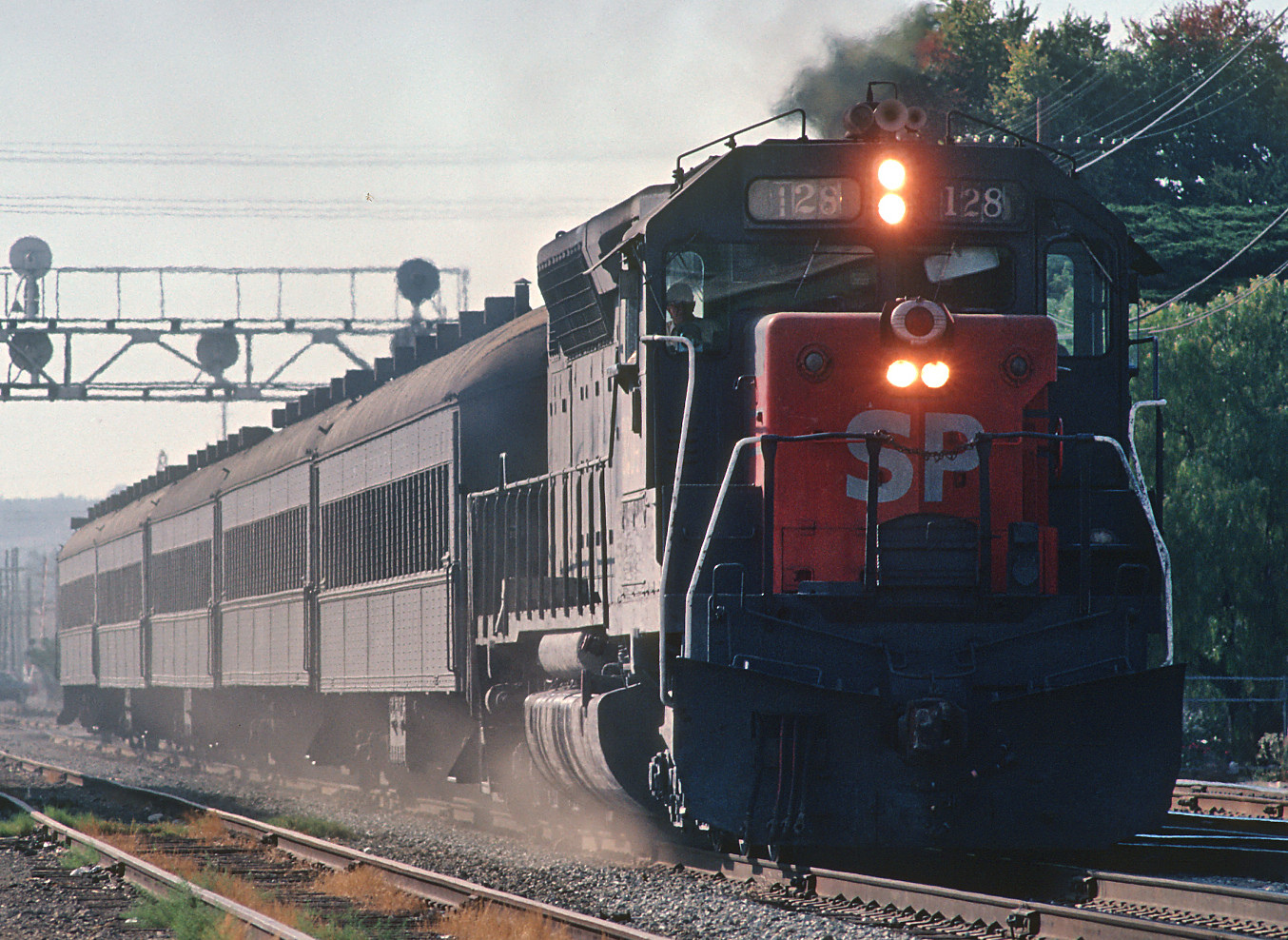 Caltrain Visual Schedule
In 1878, Marey published a famous visual train schedule based on work by Ibry. What would it look like for Silicon Valley's Caltrain? Come find out! -
 Visualizing Multiple Data Distributions
Need to compare a set of distributions of some variable? Histograms are OK, but try something fancier! Read on to learn about box, strip, swarm, and violin plots!