Improving Wikipedia's Hour Record Plot
View as MarkdownThe cycling hour record is a grueling experience: the would-be record setter rides as far as they can in one hour. The record was first set in the modern era by the great Eddy Merckx,1 and it has traded hands multiple times since. Wikipedia has this plot showing the progression:
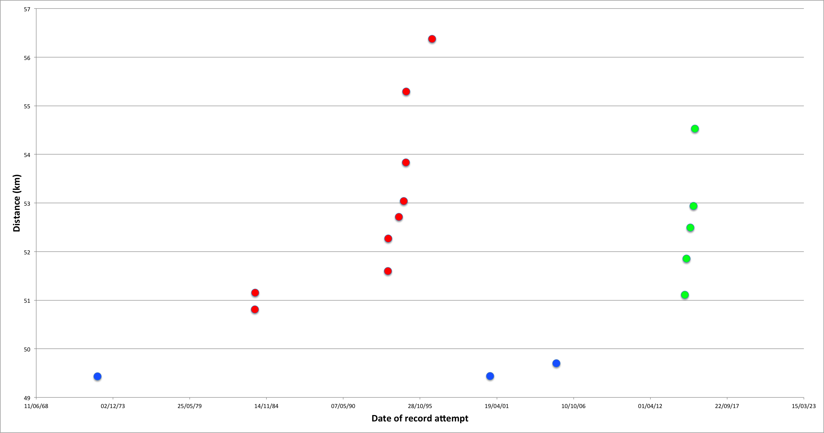
This plot gets the message across—twice, the distance went up quickly in a short amount of time—but could be much more effective. Here are some problems:
-
It is missing a legend and title, which are both necessary to understand it.2
-
It has too much precision in the date labels, which are down to the day but do not align with when the records were set.
-
The label text is too small to read easily.
-
It has a lot of unused space.
I love cycling, and I love plots, so I tried my hand at improving the plot.
Improvements
Here is my version:

I also made the same type of plot for the Women’s Hour Record progression.
The code that generated the improved plots can be found here (rendered on Github). The data is here.
I added a title and legend. The title makes the subject clear: the progression of the men’s hour record. The legend is pretty minimal, but conveys that there are three different types of record, and they are each plotted in a different color.
The tick labels are now much larger and easier to read. I have changed the date ticks to every decade because we do not really care about an exact date, just a rough time and the ordering. I have added a light shading for each decade to make them easier to tell apart. I have also removed the x-axis label because it is clear that it shows “years”.
Using the extra white space, I have added a lot more information to the plot: I have added the name of the rider who set each record, and the distance they rode. I have also added a line indicating the status of each record at each point in time, making it easy to see where the record is at any point, and helping to highlight the instances when the record stood for a long time.
This plot took a lot of work to make—matplotlib is not the most forgiving library—but I think it was worth it. Of course, as a good WikiFairy, I contributed the plots back to Wikipedia so that everyone can benefit from the improvements!