WhereTo.Photo: Using Data Science to Take Great Photos
After graduating from the University of Minnesota, I moved back to California to attend Insight Data Science. Insight is a seven week program that takes newly minted PhDs in quantitative fields and grooms them for careers in data science (I later wrote about my experience and whether you should attend Insight). The first four weeks of the program focus on building a data product using publicly available data. The project I built, Whereto.photo, tried to answer the question: Where is the best place in this city to take a picture?
In this post I’m going to walk through how I built my project from brainstorming and data processing to hosting.
Project Ideas
I had a few ideas about the sort of project I wanted to build when I arrived at Insight. The ideas were mostly based on my hobbies: cycling, running, and photography. But I knew that one of the hardest things about making a project was finding public data to use, so before settling on any idea I checked to see what data was available. There was not much data on running or cycling—Strava keeps their site locked down pretty tight—but there were a lot of photos available from Instagram and Flickr, so I decided to do a photo project.
When I arrive in a new city I generally already have an idea of what landmarks I want to shoot, maybe a sunset or a bridge or a wall caked in gum, but I don’t know the best place to go to shoot them. So the question I decided to answer was: Where can I go around here to take the best picture of X?
Answering this question would require me to determine three things about the photos that made up my data:
-
Location
-
Subject
-
Quality
Dataset
I initially explored using data from Instagram, but found that their API made it difficult to request photos from a single area, which made answering the location part of my question difficult. I settled on using Flickr because its API allowed me to ask for all photos within some radius of a fixed point which made it very easy to download just the photos taken in the cities I was interested in.
I ended up downloading every photo that was taken between June 1st, 2014 and May 31st, 2015 within 20km of the centers of San Francisco (Lat 37.74, Lon -122.42), Seattle (47.61, -122.34), and New York (40.70, -73.98). I included only public photos that were marked by Flickr as being “safe for work” (although that tag is only as good as the reviewers on the site). San Francisco had 255,232 photos, Seattle had 118,464, and New York had 474,649.
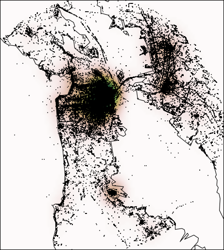
Here is every photo in my dataset for San Francisco:
Photo Subject and Quality
Once I had the data downloaded, the next step was to determine what was in each photo, and how good the photo was. Unfortunately, computer vision is hard and not something that I could tackle on the time scale of several weeks. That left me with only user applied tags as the means of determining the content of the images.
There are two types of tags applied to Flickr images. The first type are user applied tags, and the second type are machine applied tags. Machine applied tags generally just duplicate the EXIF data and so I removed them. User tags are (as their name suggests) applied by the user and may contain any information they deem appropriate. These tags often contain subjects (“golden gate”), locations (“san francisco”), equipment notes (“canon ef 50mm f/1.8”), and emotions (“sad”). All tags were converted to lowercase to remove duplicates that differed only by capitalization. Unfortunately flickrapi, which I used to make my requests, takes multi-word tags and removes the spaces leaving a single monster word. This meant that when users accessed my project I also had to strip the spaces from their queries in order to match tags.
To determine the quality of a photo I had two pieces of metadata I could use: views and favorites. I decided to use views because favorites were rare; any click was counted as a view but only logged in users could mark a photo as a favorite. I would have liked to do comparison testing of views to favorites, but views worked well enough and I felt my time was better spent elsewhere. To select the very best photos for each tag, I took the top 10% of photos in terms of views (or the first 20, whichever was larger) and used that as my dataset.
The Best Spot
Having selected the best photos for each tag, I needed to determine where the best spot to take a photo of the tagged subject.
My first attempt was to cluster the photos in space, weighted by their quality, so that the cluster centers would indicate areas of high quality photos. I tried k-means clustering and DBSCAN but found them too inflexible; some tags had a single cluster of photos while others had many, and the density and spacing between clusters varied too much from tag to tag for any single set of parameters to work.
My second attempt used kernel density estimation (KDE) to estimate the probability density of good photos in the city as a function of location. The maximum in this distribution was then the “best spot” to take a photo of the tagged thing. This algorithm worked well, except it favored areas with lots of photos, not necessarily areas with the best photos. For example, in San Francisco the maximum of the “flowers” KDE was in the financial district, not because the best flower photos were taken there, but because every tourist took dozens of mediocre photos there tagged flowers.
My solution to this was to calculate a second, global KDE for each city using every photo. I then divided the KDE for a specific tag by the global KDE which gave me a ratio: Number of Good Photos / All Photos. The maximum of this normalized function would be in a location where many good photos with the specific tag were taken, but few photos in general were taken; essentially the algorithm now preferred areas with a surprisingly large amount of quality photos instead of areas with just a large number of photos.
The maximum of this normalized KDE was computed by using the Broyden–Fletcher–Goldfarb–Shanno algorithm from SciPy. The fitter often wandered off the edge of the map and into the water, and so a penalty was applied to all points in the water (using the basemap.isWater() method). The starting locations of the minimizer were hand selected to cover the major land masses in each city.
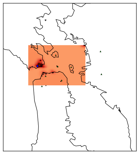
An example fit for the tag goldengate is shown below. The blue point is the estimated best location, the green triangles are the hand selected start points, the red heat map is the normalized KDE, and black dots are the photos used in the calculation.
The Website
The results of the analysis was made available on Whereto.photo. The website was served with Flask, and the maxima for each tag and the associated photos were stored in a MySQL database. The user input was lowercased and concatenated into a single string and only exact matches to tags were used.
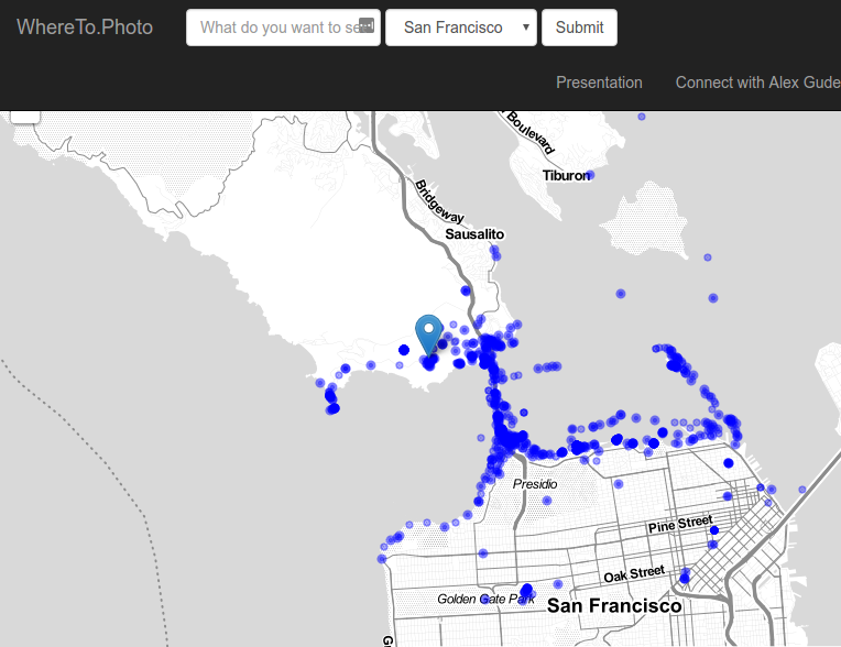
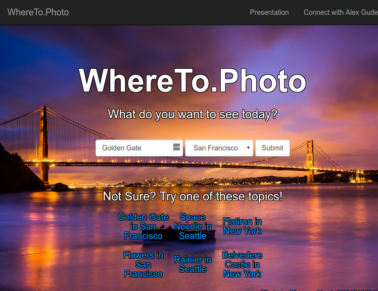
Here is what the website would show if the user searched for “Golden Gate”:
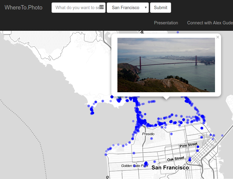
The blue circles are photos, and the blue marker is the predicted best location. You can see the best location matches the maximum found on the heat map example above. The user can click on the various photos and a preview of them would load from Flickr. This allowed the user to verify that the photos in the predicted best location were in fact great photos. Here is an example of the user clicking on a photo near the best location for the “Golden Gate” query:
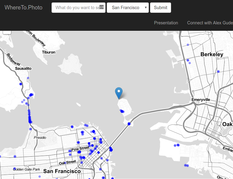
Sometimes though, the algorithm failed, as in this case for the search term “Cars”:
In this case the normalization by the global KDE made Treasure Island the predicted best location because the only photos taken there were for a car show, giving a very high ratio of good photos. While there were good car photos taken there, the event was a one time deal and so the recommendation is not generally useful.
Finally, I’ll leave you with a video of the site to give you a feel for how it worked:
