Double-checking FiveThirtyEight's 2016 Primary Predictions
View as Markdown
I’m a big fan of Nate Silver, the editor-in-chief of the data blog FiveThirtyEight. I’ve been following him since his (amazingly successful) predictions of the 2008 elections. This year he and his team are looking to repeat their previous success and have begun predicting the presidential primaries. Their work has taken some criticism from the supporters of various candidates, and so I thought it would be interesting to double-check just how well they have been performing.
The code used to perform the analysis explained in this post can be found in this Jupyter Notebook (rendered on Github). The data used are here: Republican Results, Democrat Results
FiveThirtyEight’s Polls-plus Model
FiveThirtyEight’s polls-plus model for any particular state takes into account recent polling in that state, national polling, and endorsements. Each of these components is modeled in its own manner and they are combined to build a probability distribution of each candidates’ vote share. These distributions are used to predict the likelihood of a candidate winning. For a complete overview of FiveThirtyEight’s primary model, see their description here.
Acquiring the Data
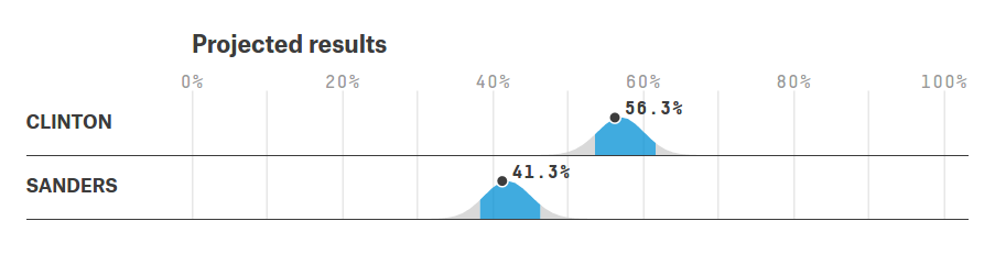
FiveThirtyEight provides their predicted vote share distributions as plots, an example of which is shown below. This plot contains the predictions for the New York democratic primary with predicted distributions for both Hillary Clinton and Bernie Sanders. The average vote share is given as a point (56.3% for Clinton and 41.3% for Sanders) and the 80% confidence interval is highlighted in blue (roughly 54 to 64 for Clinton and 36 to 46 for Sanders).
The 80% confidence interval is what we’re interested in looking at because it gives us the simplest test of how well the model has performed. This interval is the range which we expected the actual (and unobserved at the time of the prediction) vote share to fall within 80% of the time. Since these votes have now happened, we can see how often their results match the predictions.
Extracting the data from FiveThirtyEight was, unfortunately, difficult. They do not make their distributions available except in the types of plots shown above, so I went through by hand and estimated the intervals for every candidate in each state. This added some uncertainty, but probably not much more than 1 percentage point on the numbers, which is accounted for in the final result. The data on the actual outcomes was copied from Politico.
Testing the Predictions
With predictions and results in hand, it is a simple matter to count the number of times that the actual outcome fell within FiveThirtyEight’s interval (which should be about 80%), how many times their prediction was too high (10%), and how many times it was too low (again 10%). To estimate the uncertainty introduced by my reading of the plots, I ran 10,000 simulations where in each simulation every bound had a equal chance of being increased by 1, reduced by 1, or left unchanged. These modified bounds were then compared to the election results. The numbers I report use the mean from the results of these simulations, and the uncertainties are two standard deviations.
| Party | Prediction Low | Prediction Within Interval | Prediction High |
|---|---|---|---|
| Democratic | 5.5 +- 3.0% | 77.6 +- 4.2% | 17.0 +- 3.0% |
| Republican | 6.5 +- 1.2% | 78.6 +- 3.3% | 14.9 +- 3.1% |
Finally, we can visualize these results by scaling the 80% confidence interval to the interval -1 to 1. Any result from -1 to 1 is a good prediction, anything lower or higher is out of bounds. For example, if the prediction was 45% to 55% and the final result was 60%, that would appear at -2 on the this plot, where the minus sign indicates that the prediction was too low. The highest and lowest result on the Democrats’ plot are the predictions from Michigan for Clinton and Sanders respectively.

In conclusion, FiveThirtyEight is doing a good job of getting the size of the confidence interval right, 80% of the results fall within it, but they are getting the position slightly off; the actual result is lower than the prediction more than 10% of the time.
Updated : Additional analyses with this data are presented in Further Double-checking FiveThirtyEight’s 2016 Primary Predictions.